- Best Rebrand or Brand Update
- Food Manufacturing
Impossible Foods


Summary
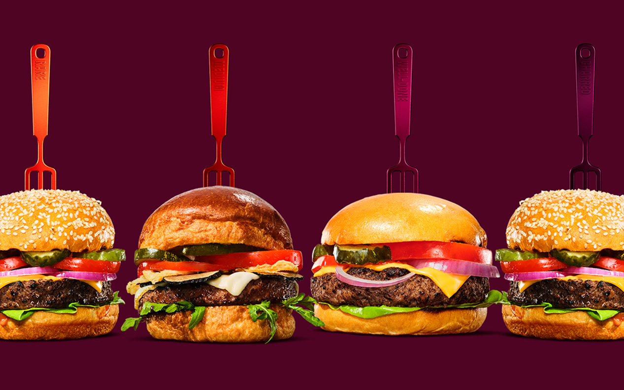
Impossible Foods has already proven successful in getting meat eaters to try its plant based products (including the ubiquitous Impossible Burger), with 90% of its consumers having identified as eating meat. But a recent study cited by Impossible showed that the majority of US consumers associate the color red with superior taste, specifically when it comes to plant-based meat packaging, the company realized that their green brand aesthetic visually reinforced a niche message.
That’s why Impossible Foods, in collaboration with branding agency Jones Knowles Ritchie, is making an intentional effort to welcome meat-eating and flexitarian consumers into the space and demonstrate that they don’t have to change their lifestyles in order to help the planet or their health. The new brand identity is inspired by the craveability of meat, staking its claim as a maker of meat – from plants, for meat lovers. This strategy not only distinguishes Impossible from other plantbased brands, but also squarely positions Impossible in the meat aisle. By being more inclusive and approachable in its own outreach to consumers, Impossible is inviting consumers to believe in a future of food that is better tasting, better for people and better for the planet.
Now, Impossible seeks to build on momentum by challenging preconceived notions of what defines “meat” – and encouraging meat eaters to do the same. And with Impossible’s products, specifically, the bold red aesthetic visually reinforces the fact Impossible meat from plants look, cook, taste, and satisfy like the animal.