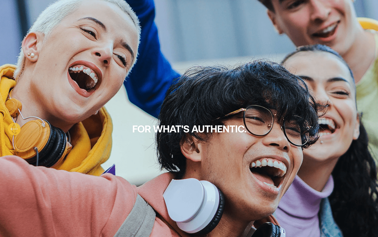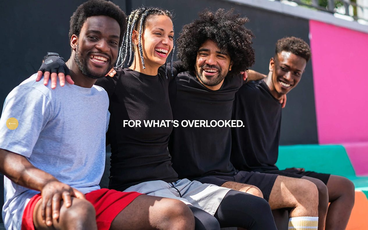

My Code Media: “Cultural Codes”
Best Rebrand or Brand Update | Professional Services
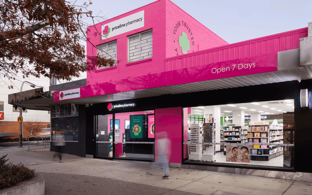
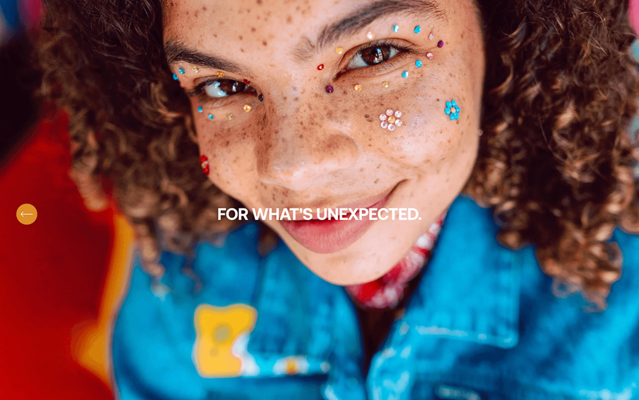
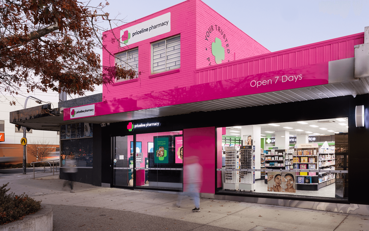
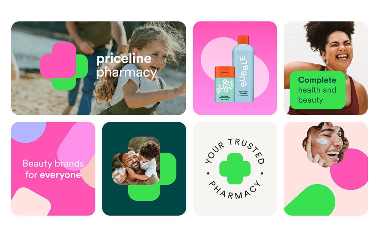
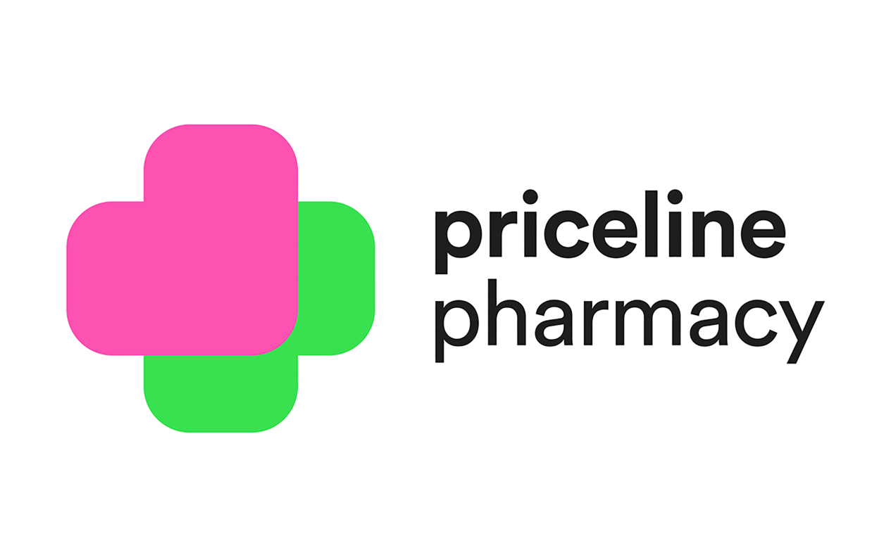
Priceline Pharmacy: “The Heart of Health and Beauty”
Best Rebrand or Brand Update | Retail
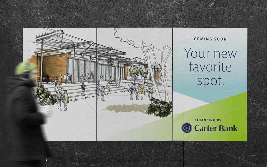
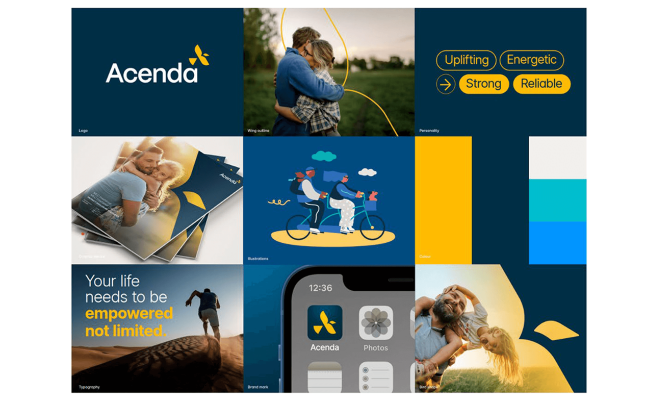
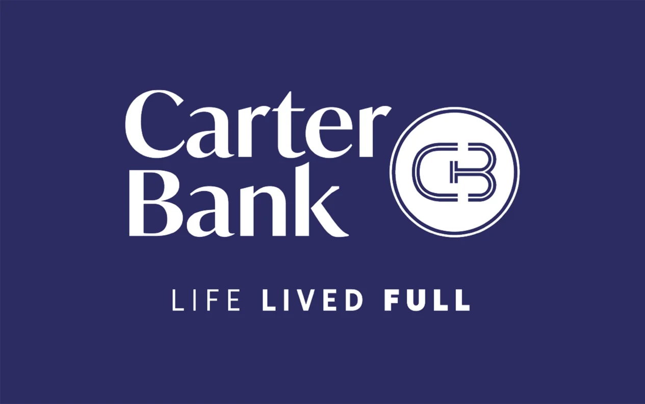
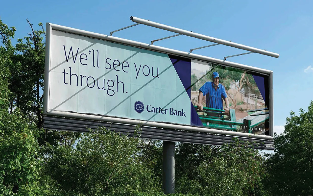
Carter Bank: "Life Lived Full"
Best Rebrand or Brand Update | Financial Services