Celebrating the year's most strategic and creative brand campaigns, rebrands, and portals that drove exceptional results.
Author
Rachel Armstrong
We’re not sure what’s better, getting an award or giving an award.
It’s our absolute privilege to announce the winners of the 2025 Brandie Awards. As many of you know, the Brandies are IntelligenceBank’s annual awards celebrating excellence in brand marketing strategy, creativity and impact. The 2025 entrants demonstrated strategic clarity, creativity, and measurable results in their marketing efforts.
This year’s winners span healthcare, finance, retail and more, showcasing how innovative branding drives measurable impact.
“The Brandie Awards honor the teams who turn brand vision into reality,” said William Tyree, IntelligenceBank CMO. “From solid brand campaigns to seamless rebrands and dynamic portals, this year’s winners prove that strategic branding is a catalyst for growth. We’re proud to spotlight their achievements.”
So without further ado…
Best Brand Campaign
Celebrating campaigns that emphasized a company’s brand identity, core message or story. Winners were driven by a specific goal to improve brand equity, awareness or another result.
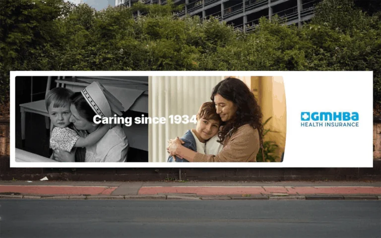
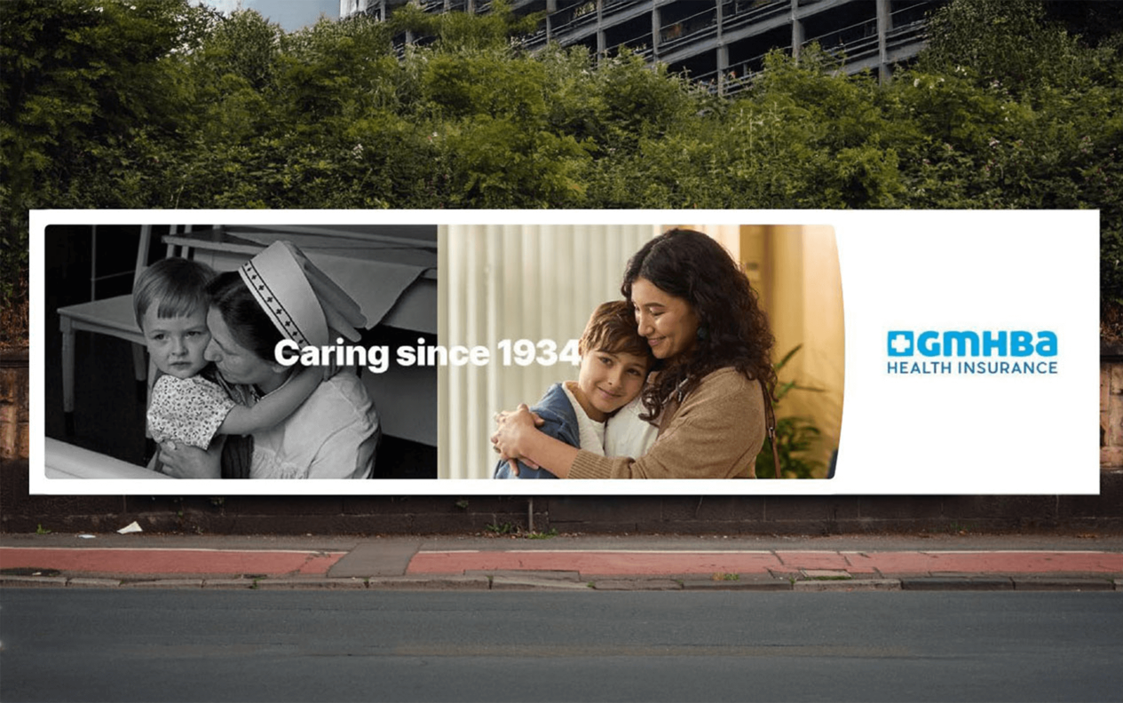
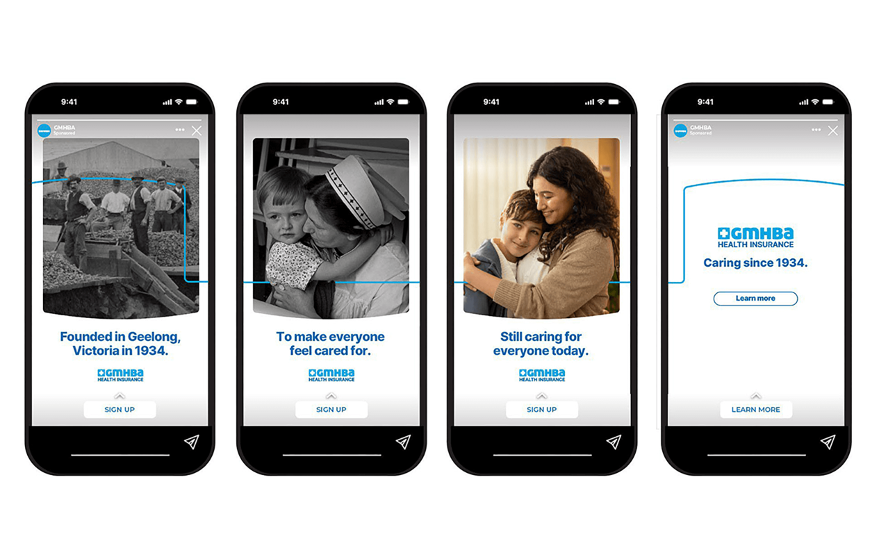
Best Overall Winner - GMHBA Healthcare: “Caring Since 1934”
Best Brand Campaign - Category Winners
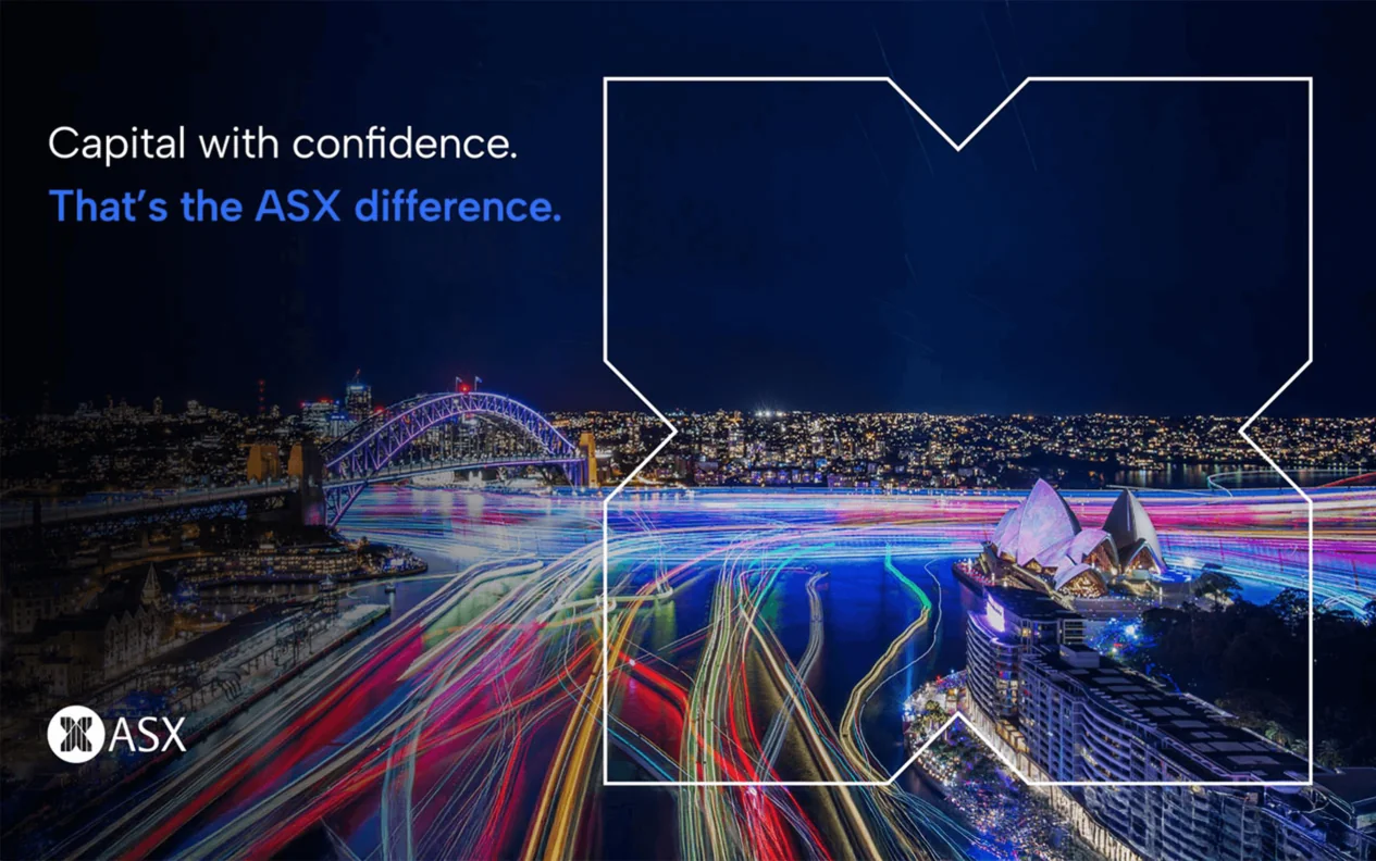
ASX: “Capital With Confidence” | Financial Markets
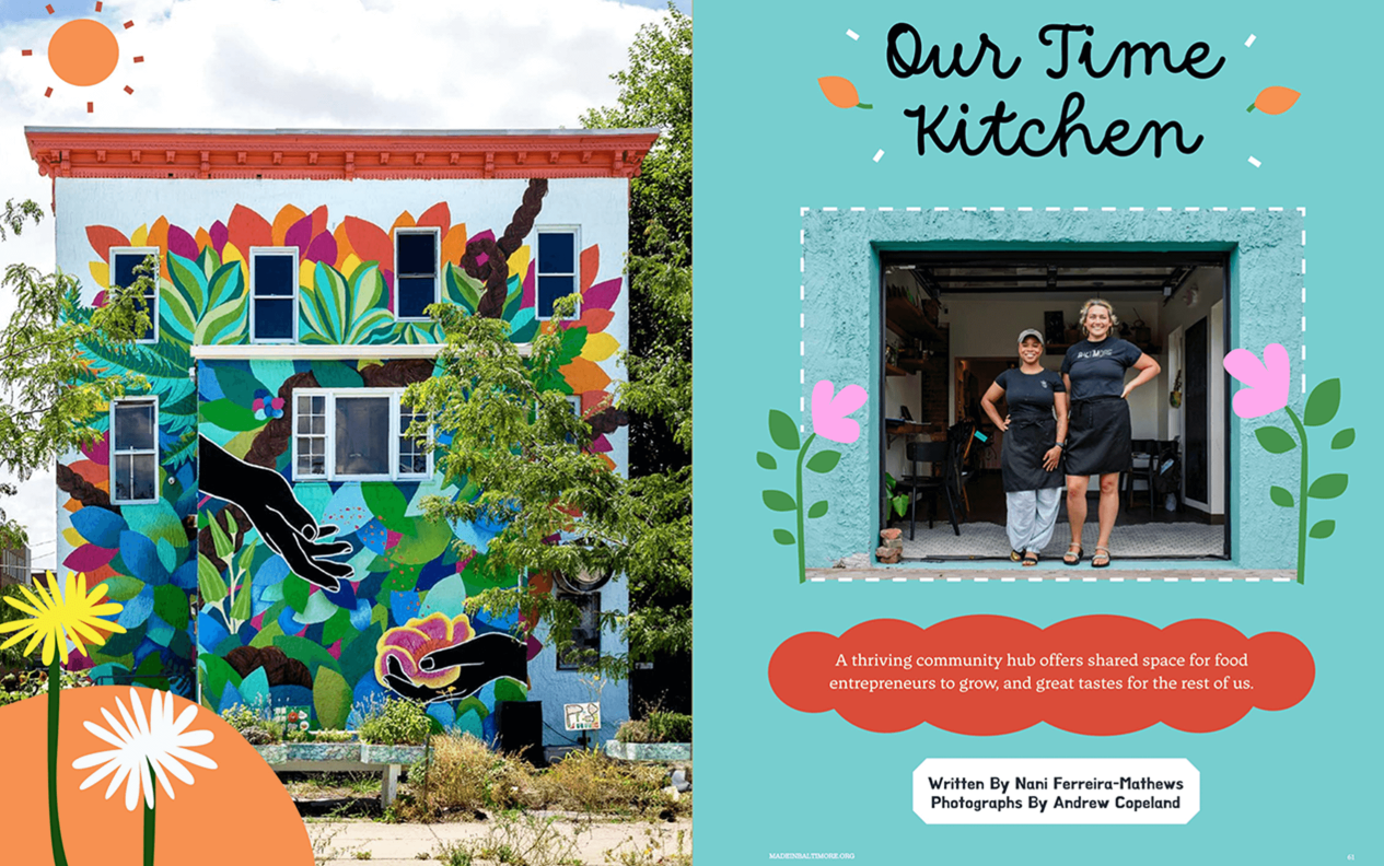
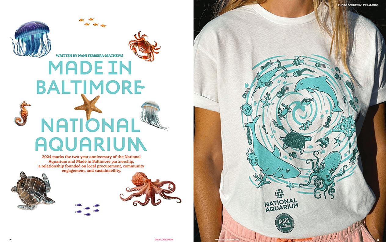
Made In Baltimore: Lookbook 2024 | Not-for-Profit
Baptist Health: “100 Days of Service” | Healthcare & Pharma
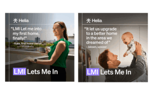
Helia: “LMI Lets Me In” | Insurance
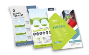
YES! Communities | Real Estate
Best Rebrand or Brand Update
Recognizing excellence in either a total overhaul in identity or a significant update in market positioning, brand relevance or emotional resonance. Winners told a compelling story about what prompted the changes as well as perceived qualitative or quantitative feedback.
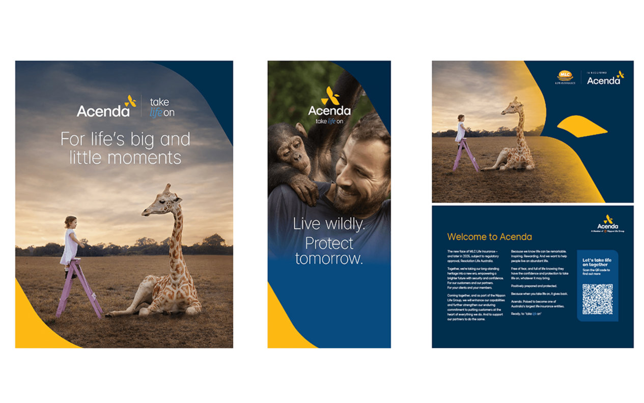
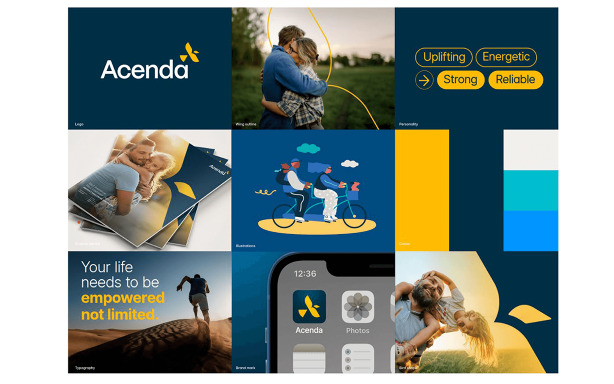
Best Overall Winner - Acenda: “Take Life On”
Best Rebrand or Brand Update - Category Winners
My Code Media: “Cultural Codes” | Professional Services
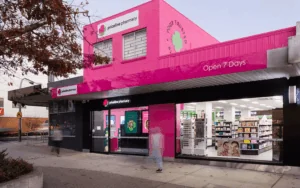
Priceline Pharmacy: “The Heart of Health and Beauty” | Retail
Carter Bank: "Life Lived Full" | Financial Services
Best Brand Portal Design and Execution
Brand portals are increasingly essential to help companies ensure brand compliance across company and partner initiatives. This award category celebrates excellence in brand portal design functionality and how it tells the brand story. Winners demonstrated outstanding UX and innovative use cases that truly enabled internal and external partners.
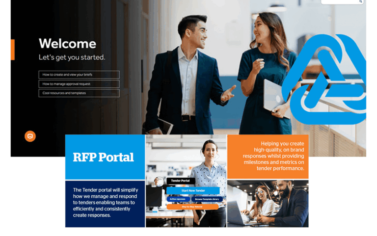
Best Overall Winner - QBE Insurance
Best Brand Portal Design and Execution - Category Winners
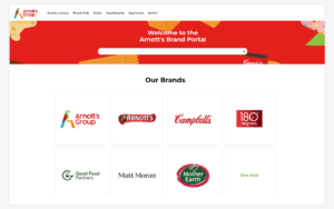
Arnott’s Group | Food and Beverage
C.H. Robinson | Logistics
Real Insurance | Insurance
McNab Group Brand Bank | Construction
The Good Feet Store | Retail
Medical Informatics Corp | Healthcare & Pharma
Congratulations once again to all the 2025 Brandie Award winners! And to every team that entered, thank you for sharing your inspiring projects with us.
Stay tuned for winner spotlights and a deeper dive in our Brand Intelligence Podcast. For those inspired by these entries, keep pushing boundaries, we can’t wait to see what you’ll achieve in 2026!
In the crowded health insurance market, GMHBA faced a critical challenge – many consumers didn’t understand their value proposition. That was until their breakthrough “Caring Since 1934” campaign tapped into the brand’s little-known origin story. Historically GMHBA were known as champions of working-class Australians. They cleverly transformed this historical legacy into modern competitive advantage. By reframing their 1934 roots as proof of enduring values rather than pure nostalgia, GMHBA achieved remarkable results: 36% of consumers gained clearer understanding of their mission, while emotional connection scores jumped, with many specifically recognizing GMHBA’s caring ethos as distinctive. The campaign’s authentic storytelling drove tangible business outcomes too – far higher consideration intent and significant increases in website/call engagement. This is a great result for an industry often reduced to transactions and proof that genuine heritage builds trust. Rather than just selling policies, GMHBA demonstrated how 90 years of consistent care creates brand equity and gives health insurance a much-needed human face while strengthening its market position.
Best Brand Campaign
Financial Markets
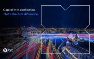
ASX: “Capital With Confidence”
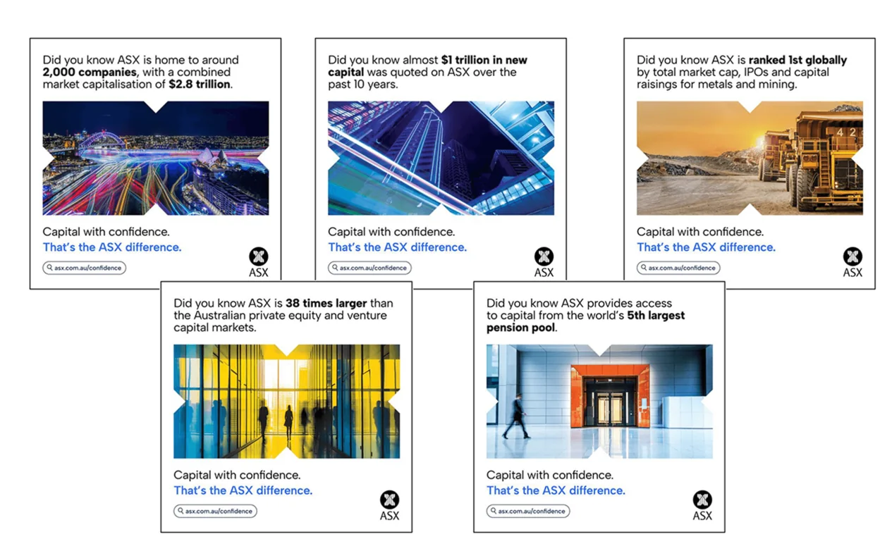
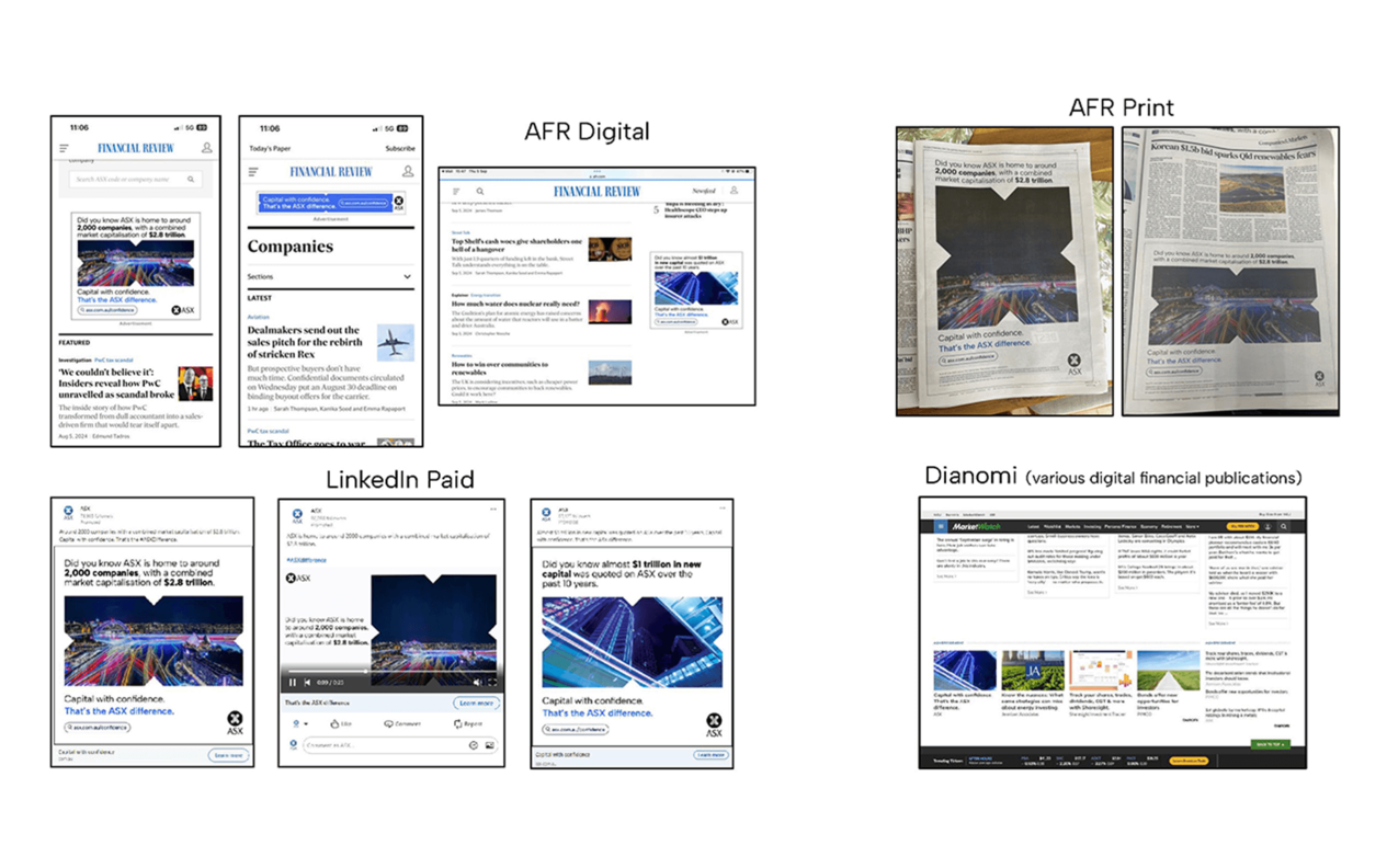
When negative narratives threatened to overshadow the Australian Securities Exchange’s (ASX) strengths as a global listings destination, the exchange responded with its groundbreaking “Capital with Confidence” campaign. Facing unprecedented challenges – from budget constraints to an untested in-house creative team – ASX delivered a masterclass in strategic repositioning.
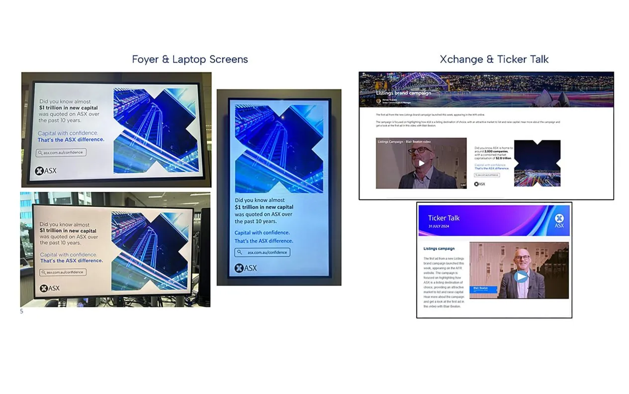
The campaign’s multi-channel approach, spanning targeted LinkedIn ads, international roadshows, and innovative public installations at Exchange Square (ASX HQ), drove remarkable results. Brand perception scores rose steadily on Reptrak’s index, while listings website traffic exploded, with new visitors accounting for the majority of the surge. The team’s resourcefulness shone through in every aspect, from achieving an impressive cost-per-click to transforming corporate headquarters into a public engagement hub that drew crowds and social media attention. Perhaps most impressively, the campaign’s success extended beyond metrics – it equipped the ASX listings team with powerful talking points for international pitches and created visible momentum that helped counter broader market skepticism. In an environment where confidence was scarce, ASX demonstrated how strategic marketing could become a competitive advantage for an entire financial ecosystem.
Best Brand Campaign
Not-for-Profit
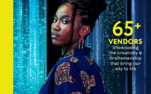
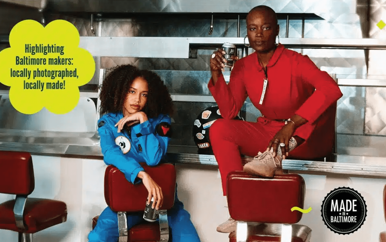
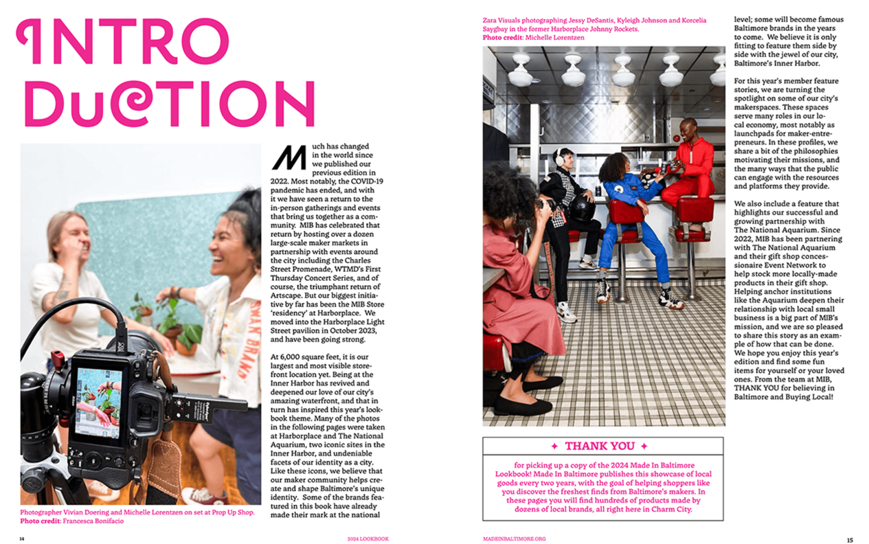
Made In Baltimore: Lookbook 2024
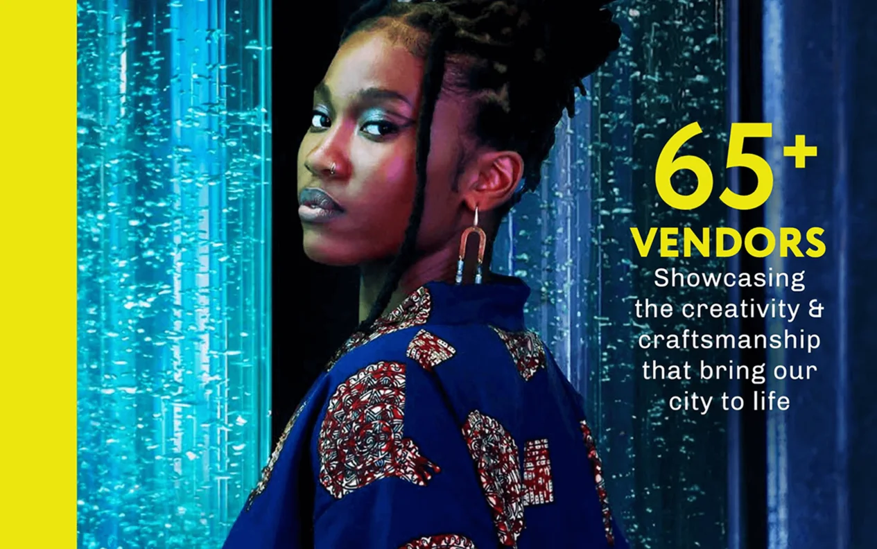
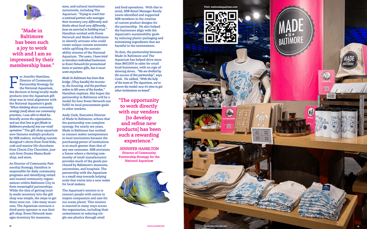
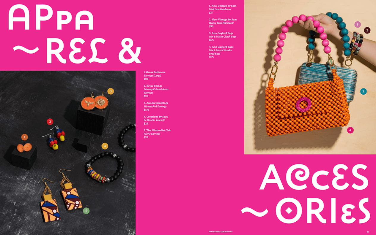
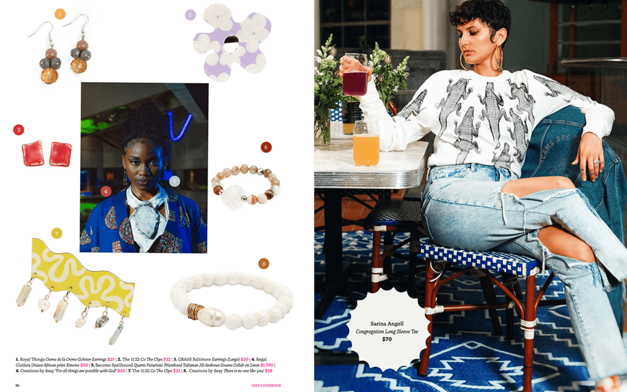
When the Made in Baltimore team set out to create their biannual Lookbook, they envisioned more than just a catalog – they wanted to build a movement. Faced with the challenge of coordinating 65+ local makers and 10 creative consultants, the team developed a meticulous production process anchored in community collaboration. The result was a stunning, editorial-quality publication that balanced diverse creative voices with cohesive design, transforming what could have been a simple product guide into a compelling showcase of Baltimore’s creative economy.
The impact was immediate and far-reaching. The Lookbook’s success was measured not just in impressive digital metrics, but in tangible business outcomes for Baltimore’s artisan community. Its global reach surprised even the organizers, with engaged readers in 10+ countries spending an average of 5 minutes 34 seconds immersed in the digital version – an eternity in publishing terms. Local retailers began using it as a sourcing guide, leading to new wholesale opportunities for featured makers, while city officials praised its professional presentation as validation of Baltimore’s growing creative economy. The Lookbook’s greatest achievement may have been how it strengthened connections within Baltimore’s maker community itself, fostering cross-promotion and collaboration that extended far beyond the printed page. By giving home-based businesses and emerging brands the same polished presentation as established retailers, the Lookbook not only documented Baltimore’s creative scene, but also created a powerful platform for economic growth and community pride that resonated from neighborhood shops to international audiences.
Best Brand Campaign
Healthcare and Pharma
Baptist Health: “100 Days of Service”
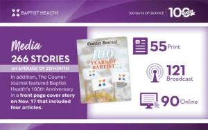
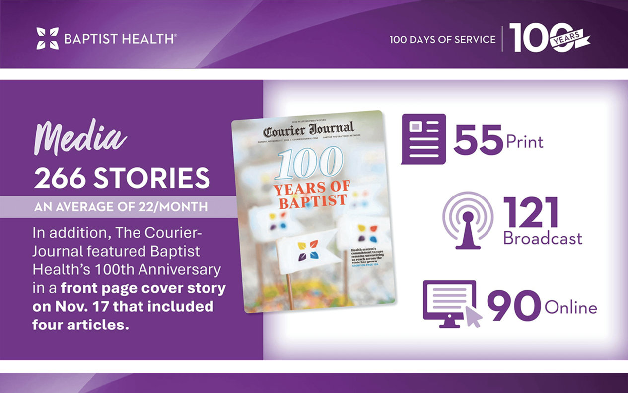
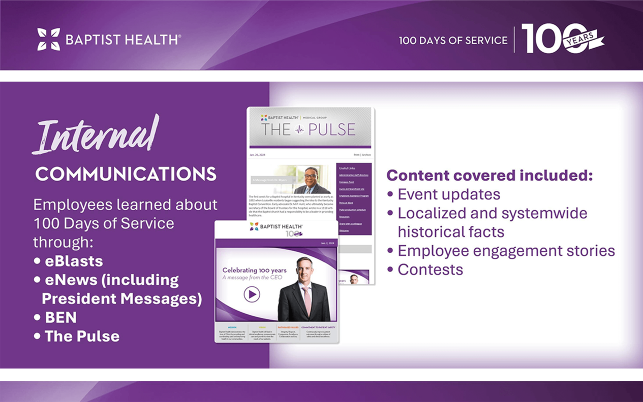
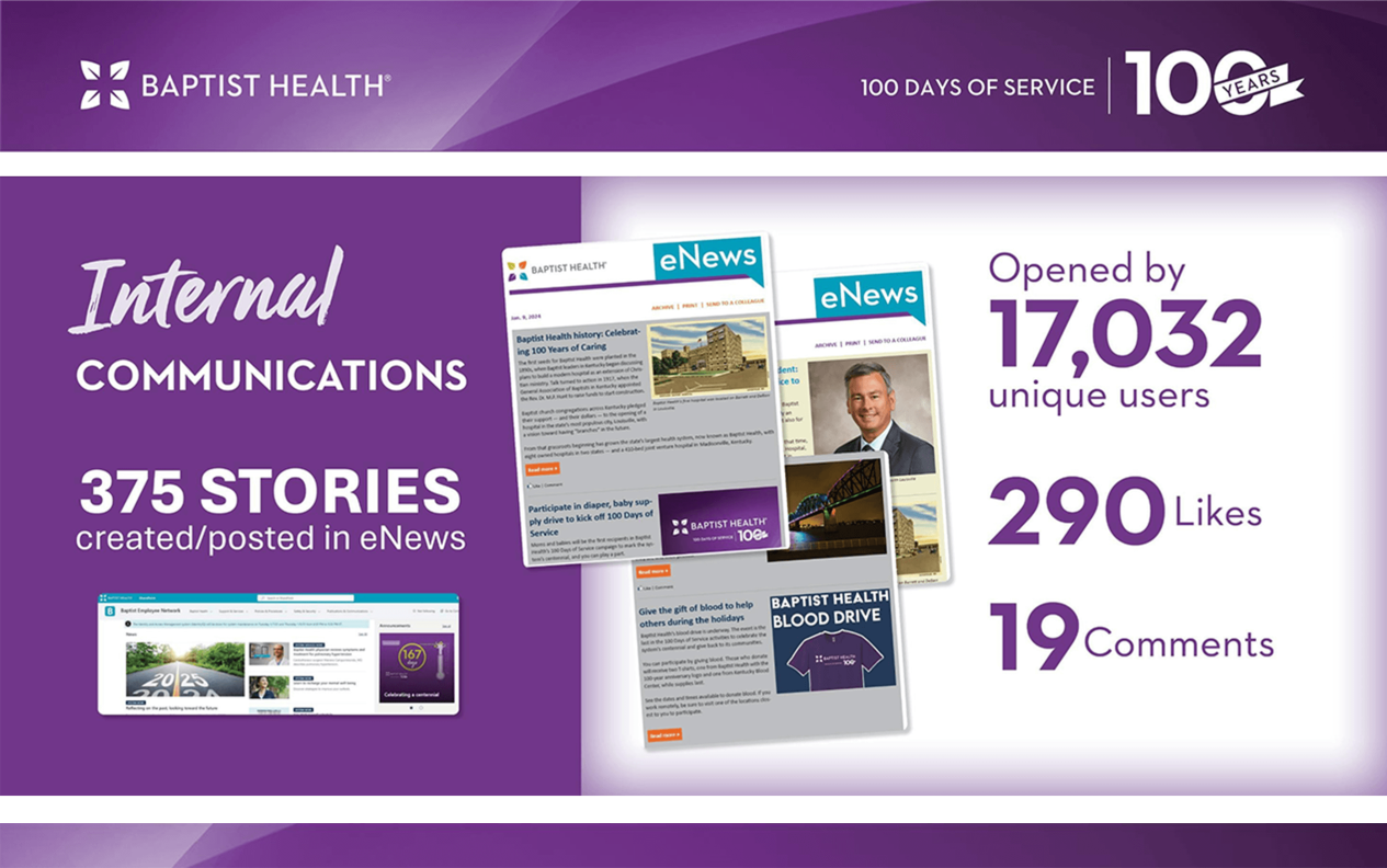
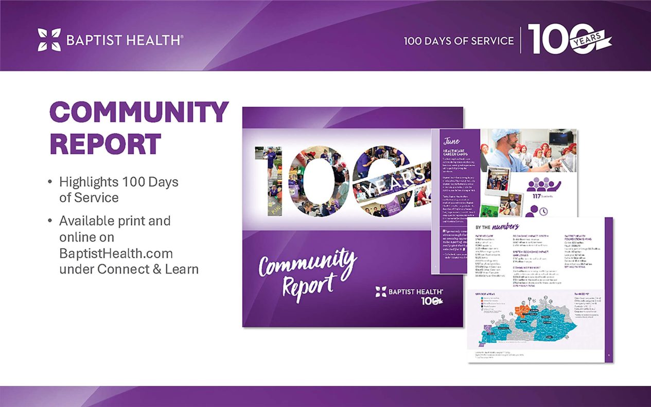
In 2025, Baptist Health transformed its 100th anniversary into a powerful demonstration of community care through its “100 Days of Service” campaign. Each hospital in their network hosted monthly health screening initiatives and donations that collectively, touched over 11,000 lives. The campaign masterfully balanced nostalgia with forward-looking energy, achieving record-breaking engagement that shattered healthcare industry standards. Local media amplified these efforts with 266 stories celebrating Baptist Health’s legacy, while internal participation soared. Beyond the numbers, the initiative proved how purpose-driven healthcare marketing works – by meeting communities where they live, whether through blood drives that collected 350 units or volunteer efforts that cleaned 258 bags of trash from neighborhoods. By weaving storytelling, data, and grassroots action into every facet of the campaign, Baptist Health didn’t just commemorate history, it reinforced its position as Kentucky’s preferred healthcare provider for the next century.
Best Brand Campaign
Insurance
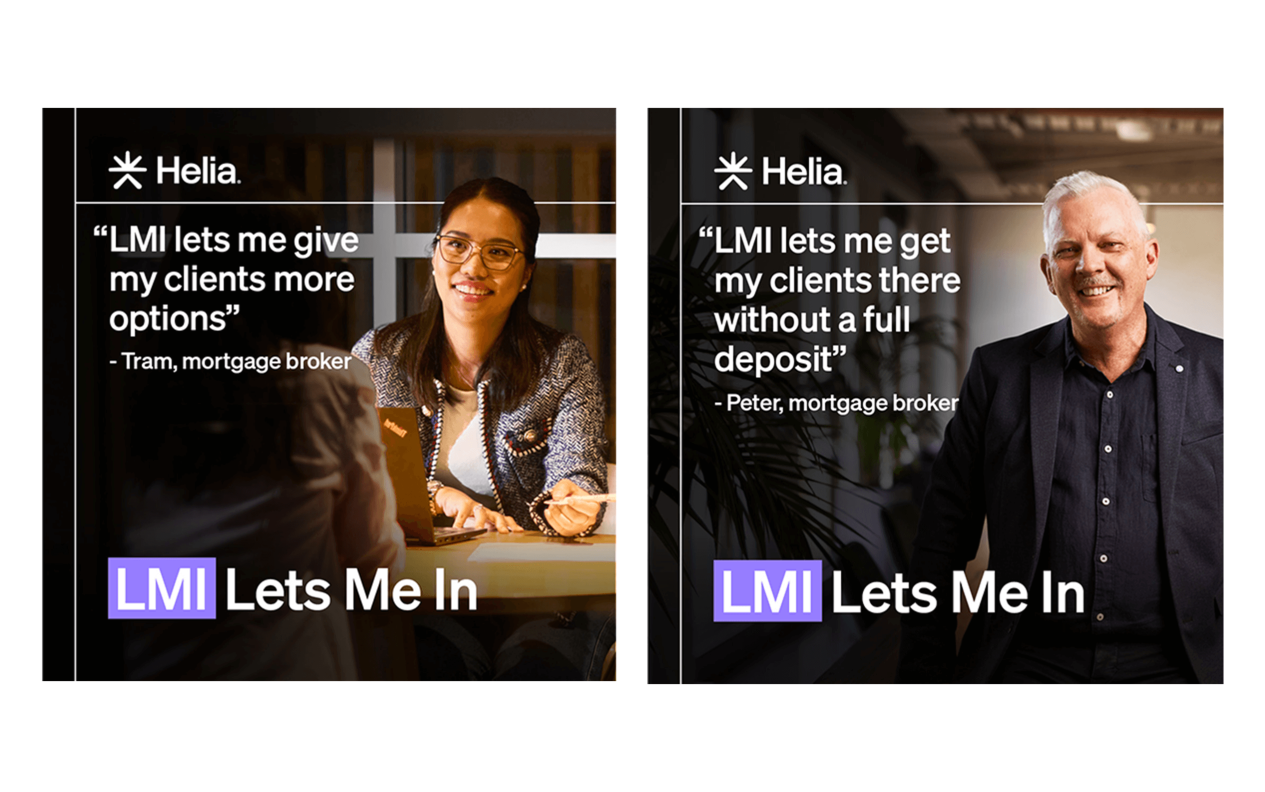
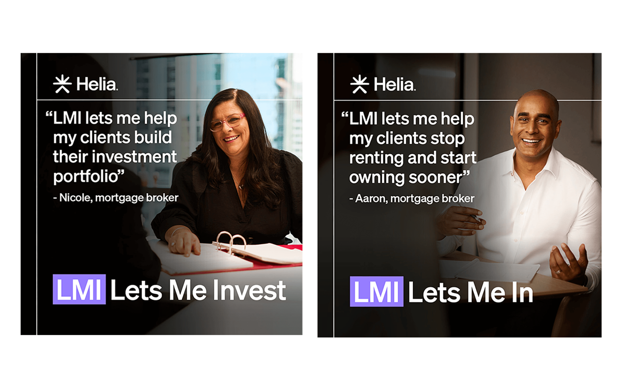
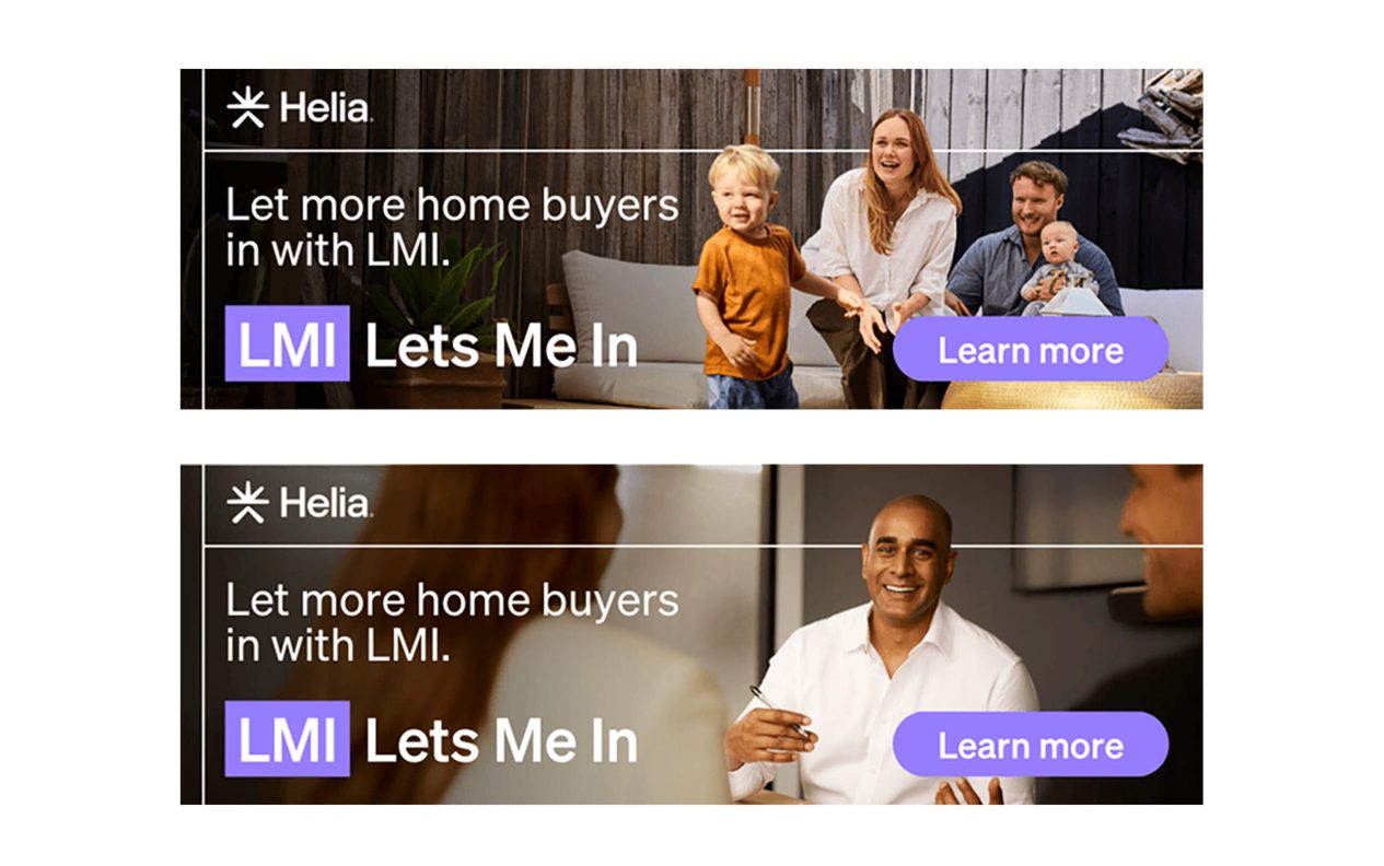
Helia: “LMI Lets Me In”
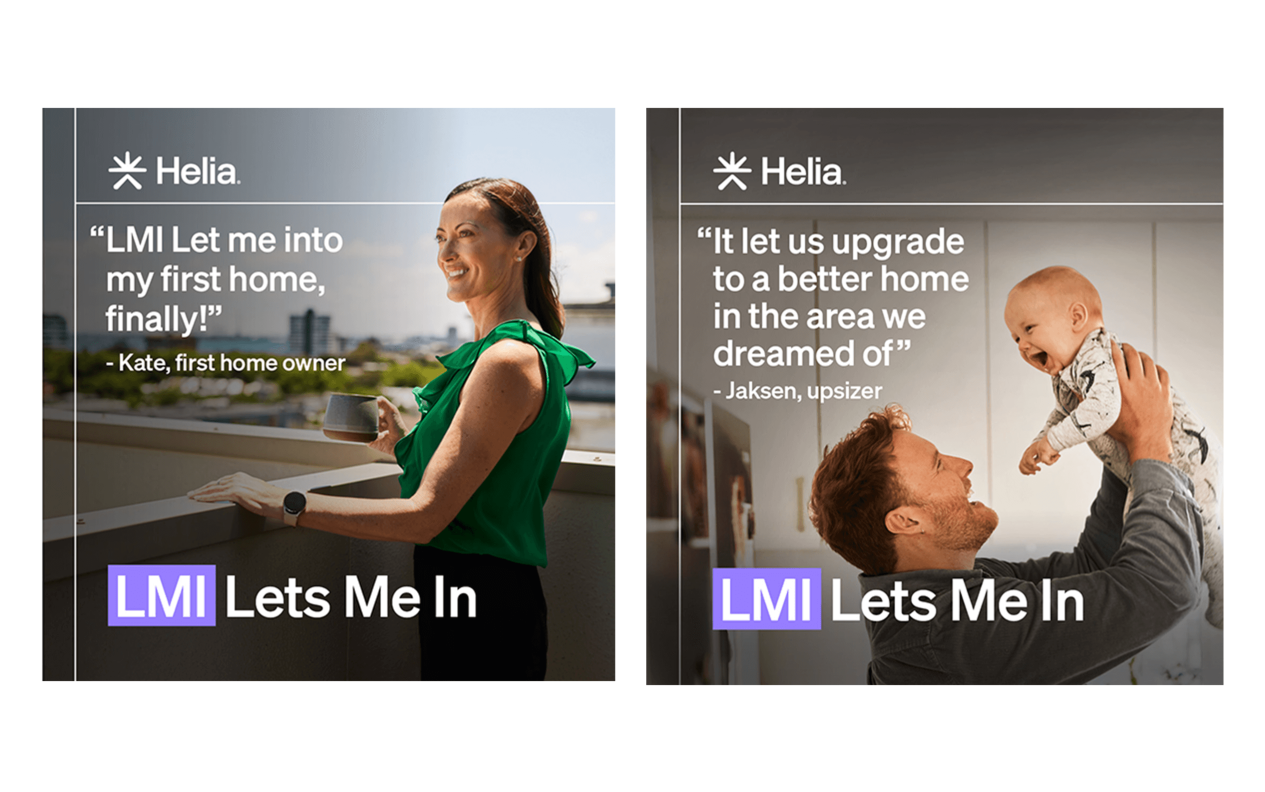
Australia is experiencing a housing affordability crisis. Saving the required 20% deposits feels impossible and the “Bank of Mum and Dad” is tapped out. Helia’s “LMI Let’s Me In” campaign aimed to transform the view of Lenders Mortgage Insurance as a last resort into a powerful first choice. The campaign tackled entrenched broker hesitations (99% awareness but low confidence in recommending) and buyer misconceptions (viewing LMI as pure cost rather than opportunity) through three masterstrokes: Firstly, a linguistic wordplay reframed the LMI acronym into an aspirational mantra; “Lets Me In”. Secondly, Broker tools and training enabled them to shift conversations earlier in the homebuying journey. And lastly, human proof points featured real mortgage brokers and buyers demonstrating how 5% deposits could stop rental cycles and start generational wealth building.
The campaign’s surgical focus on mortgage brokers – gatekeepers influencing 75% of loans ensured maximum impact, with trade media engagement soaring above benchmarks and Google Search CTRs surging as brokers actively sought LMI information. By anchoring the transformation in authentic stories rather than product specs, Helia didn’t just run a campaign, they sparked an industry mindset shift where LMI became synonymous with possibility rather than compromise.
Best Brand Campaign
Real Estate
YES! Communities
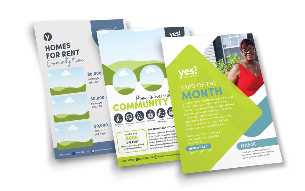
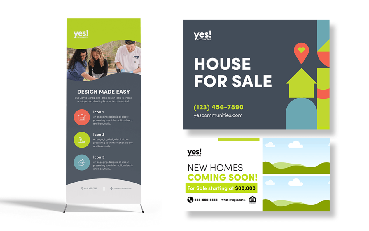
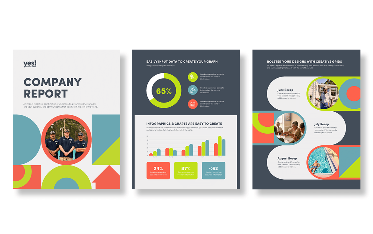
YES Communities is a vibrant, people-first brand offering affordable, quality manufactured homes in safe, well-maintained neighborhoods. This design work embodies the brand’s values of clarity, warmth, and trust. Rooted in modern simplicity, the work transcends traditional corporate aesthetics to foster genuine connections – both with homes and the people who inhabit them.The collateral is cleanly designed to balance utility and emotion, from functional signage like home listings to resident-focused initiatives like ‘Yard of the Month’. Visually, the work combines generous white space with geometric motifs and a vibrant-yet-soft palette, resulting in a modern system that feels both structured and inviting.
The result is a brand experience that feels welcoming yet polished, mirroring the supportive ethos of the communities it serves. From banner stands to printed reports to in-community awards, every touchpoint reinforces a sense of pride and cohesion.
This campaign doesn’t just market properties, it cultivates belonging.
Best Rebrand or Brand Update
Insurance (Best Overall)
Acenda: “Take Life On”
When MLC Life Insurance embarked on its transformation into Acenda, it wasn’t just changing a name – it was challenging an entire industry’s approach to life insurance. Research revealed a sector trapped in fear-based messaging which left customers emotionally disengaged. Acenda’s objective was to shift life insurance from being about death to being about living well and encouraging people to “take life on” with confidence.
This radical repositioning required navigating multiple challenges: honoring a 138-year legacy while signaling renewal, overcoming cultural discomfort around mortality discussions, and preparing for a major merger with Resolution Life Australasia. The solution emerged in Acenda’s emotionally intelligent brand platform – a vibrant visual identity and compassionate voice that reframed protection as an act of care and continuity rather than just risk mitigation.
The results demonstrated the power of this human-centric approach. The soft launch generated exceptional engagement metrics that far exceeded financial services benchmarks, including customer emails achieving a remarkable 62% open rate and adviser webinars showing an 88% completion rate, with attendees staying engaged for an average of 26.5 minutes of the 30-minute session. On LinkedIn, Acenda’s content saw 26,099 video views and top-tier engagement rates, successfully positioning the new brand as a thought leader sparking important industry conversations.
The brand transition was executed with such clarity that only a single customer service call was received about the change. Crucially, financial advisers, (a historically challenging audience), responded enthusiastically to Acenda’s fresh approach.
Internally, the rebrand served as a powerful cultural unifier, with teams at all levels embracing Acenda’s mission as both an external promise and internal compass for innovation.
Best Rebrand or Brand Update
Professional Services
My Code Media: “Cultural Codes”
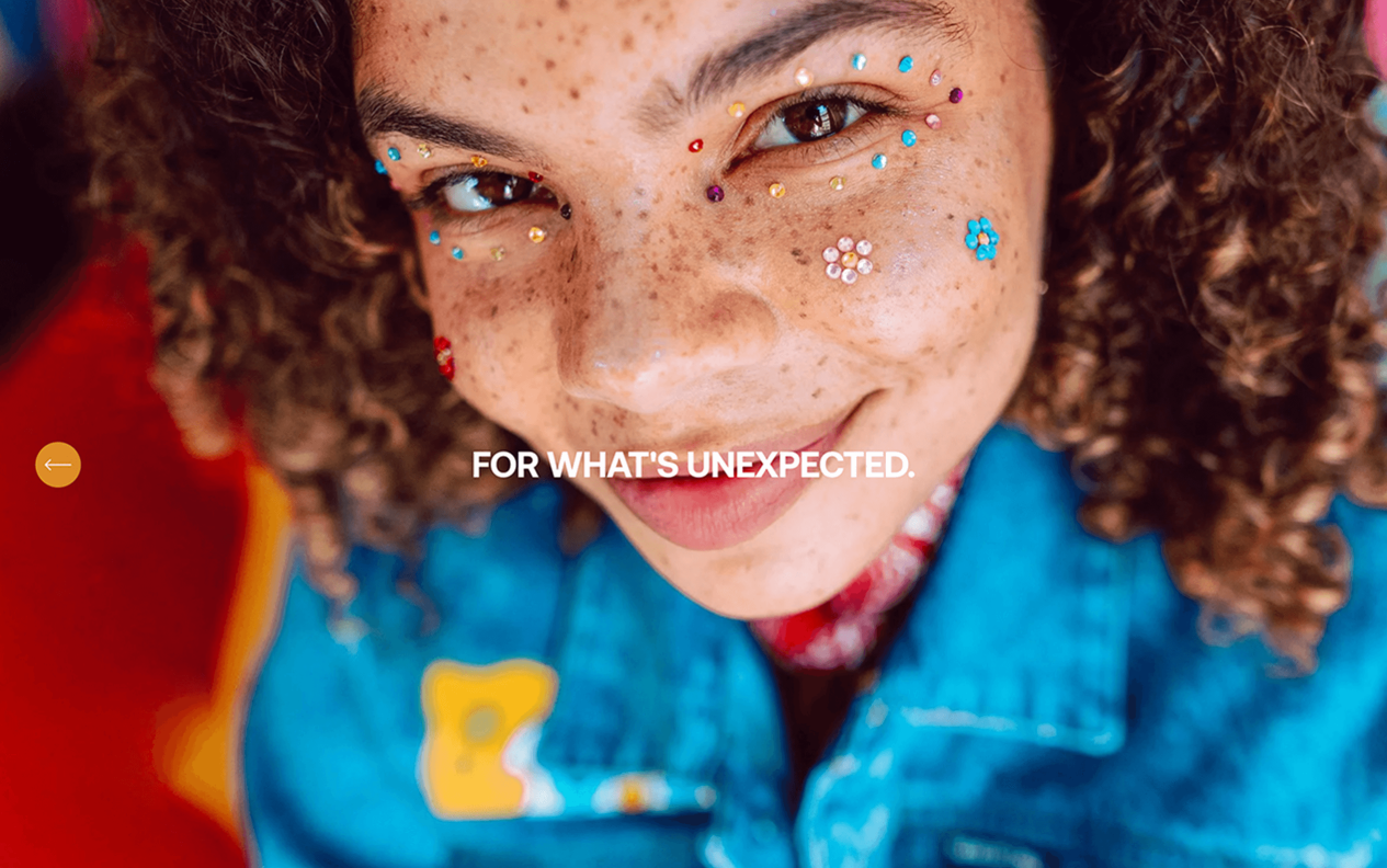
My Code Media recently redefined their multicultural marketing model by pioneering a “cultural codes” approach that connects brands with diverse audiences through shared passions rather than demographic labels. Recognizing that today’s consumers, (especially in multicultural and LGBTQIA+ communities), define themselves more by interests like sports, beauty, and music than traditional categories, they’ve built a cultural intelligence platform that decodes these intersections. This work has not only changed their methodology, but spurred a rebrand of their business. Their work includes strategic creator networks and collaborations like NFL documentaries and Sephora beauty campaigns, which generated 14 million video views while outperforming benchmarks by 4x. With a reach of 95 million monthly users through 1,200+ publishers, My Code delivers proven impact – their campaigns drive significantly higher brand awareness and far greater ad recall than industry standards. Unlike conventional agencies that segment audiences, they specialize in finding cultural overlaps, helping brands like Pepsi create campaigns that resonate across communities. Recent metrics show a 26% surge in video views and 20% social engagement growth post-rebrand, proving their model doesn’t just reach audiences but influences cultural trends. By treating culture as a living ecosystem rather than a checklist, My Code has become the essential partner for brands wanting authentic connections in today’s fluid identity landscape.
Best Rebrand or Brand Update
Retail
Priceline Pharmacy: “The Heart of Health and Beauty”
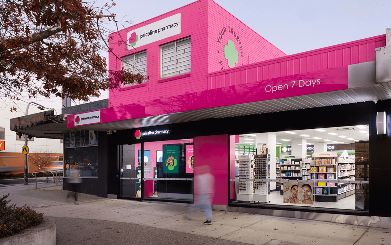
After 40 years as a retail icon, Priceline Pharmacy faced a critical crossroads in 2024. While maintaining strong brand awareness, other indicators signaled waning relevance in today’s health-and-beauty landscape. The challenge was clear: modernize without losing the trusted heritage that made Priceline Pharmacy beloved, while differentiating from both discount chemists and premium beauty retailers.
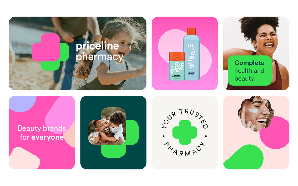
The solution emerged through deep customer insights – Priceline’s unique advantage was its ‘heart’: the compassionate care of 1,400 pharmacists and 800 beauty advisors across 470 franchise locations. This inspired a complete brand transformation anchored by the new promise “the heart of health and beauty,” visually symbolized through an elegant logo where two hearts form a pharmacy cross. The rebrand extended to every touchpoint – from a vibrant new color palette (replacing dated magenta with bold pink) to a “clever-hearted” tone of voice that balanced expertise with warmth.
The results demonstrated the power of this strategic refresh across multiple dimensions. Customer perception metrics showed meaningful improvement with brand consideration rising and NPS significantly improving, while the Sister Club loyalty program achieved impressive year-over-year growth in sign-ups alongside an increase in active card scans.
The Christmas campaign that launched the rebrand delivered standout engagement and sales performance, proving the commercial impact of the new positioning. Perhaps most significantly, health services saw impressive growth reflected increases in non-COVID vaccinations and script volumes – clear evidence that Priceline had successfully reinforced its pharmacy credentials while maintaining its beauty appeal.
Beyond the numbers, the rebrand achieved something equally valuable by reigniting pride across the franchise network, with a record 380 team members attending the post-launch conference and internal surveys showing boosted engagement across all 470 locations. This comprehensive impact – spanning customer perception, commercial performance, service growth and team morale – proved Priceline Pharmacy’s transformation had not just updated its appearance, but fundamentally strengthened its market position as Australia’s most caring destination for whole-self wellbeing.
Best Rebrand or Brand Update
Financial Services
Carter Bank: "Life Lived Full"
For over 50 years, Carter Bank has served its communities with a steadfast commitment to helping people and businesses prosper. In October 2024, the bank unveiled a bold new brand identity—its first full-scale rebrand since its founding in 1974. What began as a small rural bank had grown into a publicly traded institution, but its brand hadn’t kept pace. The transformation was guided by extensive research, including focus groups, surveys, and strategy sessions, to reflect the bank’s modern capabilities while staying true to its community-first values.
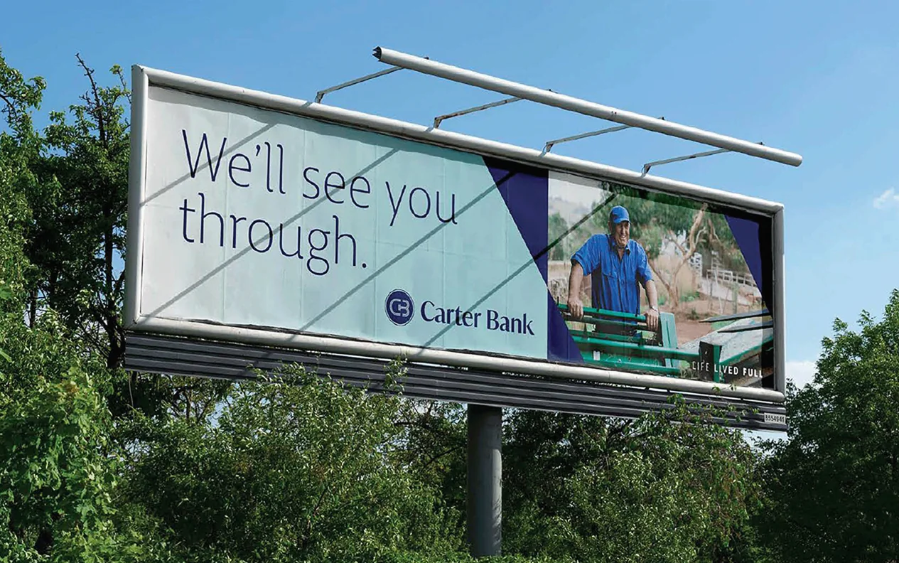
The new brand positions Carter Bank as approachable, relationship-driven, and forward-thinking, reinforcing its role as a trusted guide for individuals, families, and businesses. Visually, it features a fresh, confident identity with approachable design elements, a refined brand voice emphasizing clarity and connection, and updated values centered on building relationships, earning trust, and taking ownership.
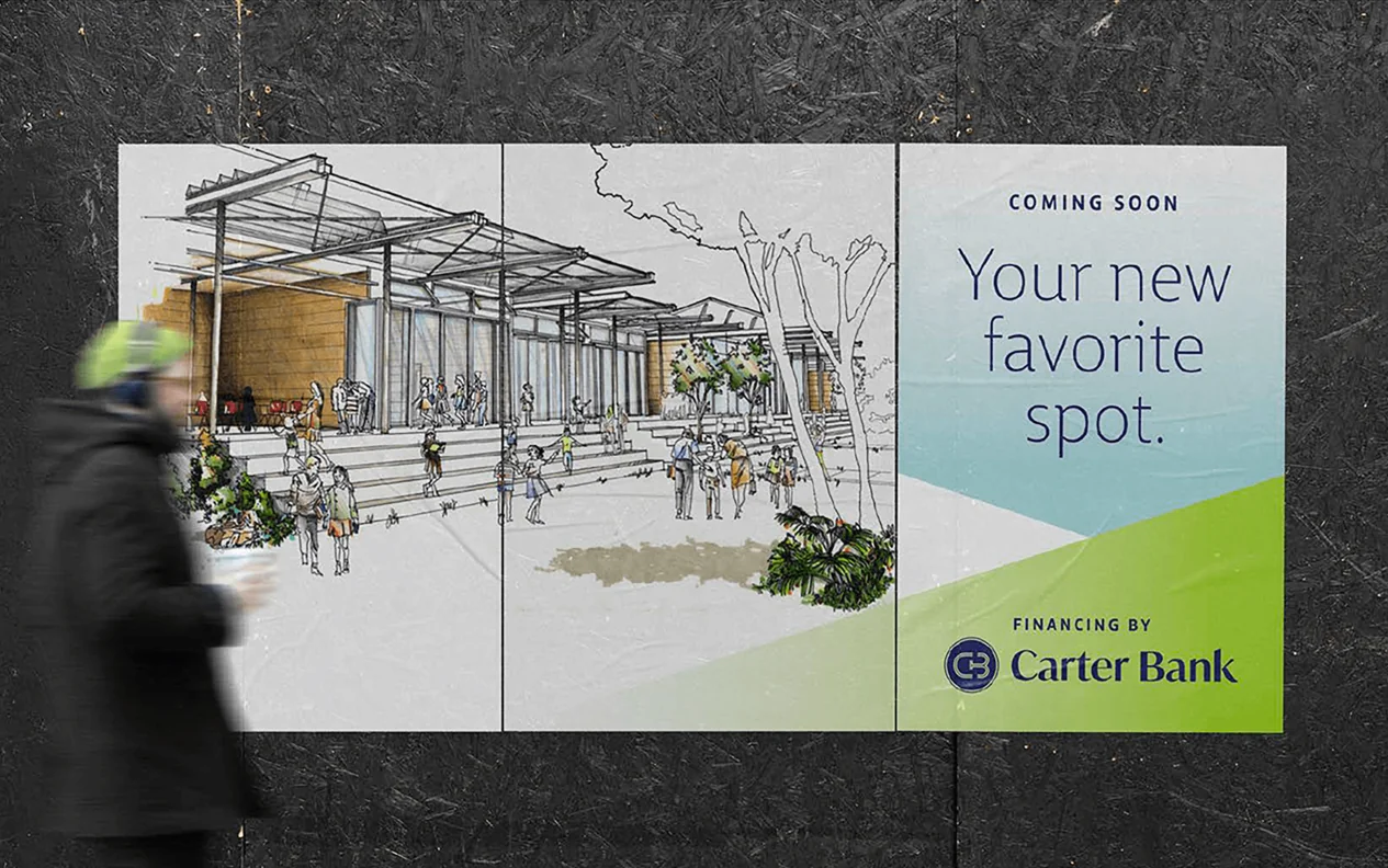
Balancing tradition with innovation was the central challenge—evolving the brand without losing the authenticity long valued by customers. The rollout spanned every touchpoint, from branch signage to digital platforms, and was met with overwhelmingly positive feedback. Associates embraced the change with renewed pride, customers felt a deeper connection, and the broader community celebrated the new identity
Best Brand Portal Design and Execution
Insurance (Best Overall)
QBE Insurance
As well as being beautifully designed, QBE’s brand portal revolutionizes risk management by transforming chaotic approval workflows into a precision-engineered compliance hub ‘QBE Market’. Serving 1,000+ users across the globe, the brand platform has slashed production time from 24 hours to 5 minutes with the help of creative templates that help maintain ironclad governance over more than 1,700 annual approvals. Its design cleverly balances regulatory rigor with operational agility, evidenced by a 57% year-over-year surge in creative template downloads and 28% more briefs created. The platform’s ‘At the Heart of It’ philosophy extends beyond marketing, with 18+ non-marketing teams like Legal and Compliance now onboarded – a testament to its enterprise value. User-centric dynamic inclusions like the QBuddy AI chatbot and 60-second video tutorials have reduced support queries by 40% while accelerating onboarding. The ‘QBE Market’ hub proves that even in high-regulated industries, compliance and creativity can coexist when powered by intelligent design. From streamlining over 20 active tender responses via the RFP portal to maintaining audit-ready trails for risk mitigation, QBE Market isn’t just managing assets, it’s redefining how global insurers scale both safety and speed.
Best Brand Portal Design & Execution
Food and Beverage
Arnott’s Group
Arnotts’ brand portal elegantly solves a classic corporate challenge – how to transform the food giant’s scattered assets (once strewn across OneDrive, Dropbox, and desktops) into a vibrantly efficient, single source of truth that honors their parrot-branded heritage. The design thoughtfully mirrors Arnotts’ iconic visual identity, using their signature color palette and minimalist navigation to create instant brand recognition for internal teams and global partners.
Beyond aesthetics, the portal’s true brilliance lies in its dual functionality: as a meticulously organized asset library (preventing outdated content usage) and a collaborative briefing hub that streamlines campaign workflows. Early adoption by pilot users has already validated the approach, with teams praising the intuitive access to approved logos, packaging designs, and marketing templates. By marrying Arnotts’ cherished legacy with modern UX principles, the portal doesn’t just store assets – it extends the brand’s promise of authenticity and trust into the digital realm, setting the stage for scaled rollout across international markets.
Best Brand Portal Design and Execution
Logistics
C.H. Robinson
C.H. Robinson is a leading global third-party logistics company that ships $23 billion worth of freight every year. With offices across the globe and over 14,000 employees, they faced a huge challenge when it came to making sure they stayed on brand. Issues such as team members using out of date branding, offices applying inconsistent use of branding elements as well fragmented access were not only damaging the brand but highly inefficient. The creation of the ‘Brand Center’ an online brand portal that served as a hub for all things brand was the solution.
Designed to be intuitive so assets are easy to find, and visually engaging so it reflects C.H. Robinson’s brand personality, the portal features a clean layout, user-friendly navigation, and dynamic imagery, making it both functional and inviting.
Since launch, the Brand Center has driven impressive adoption, with 7,000+ unique users in its first quarter, 9,000+ asset downloads, and 25,582 page views.
By providing a single source of truth for branding, the Brand Center has not only eliminated inefficiencies but also elevated C.H. Robinson’s brand presence—ensuring every interaction, internal or external, reflects the professionalism and reliability of a global logistics leader.
Best Brand Portal Design and Execution
Insurance
Real Insurance (Direct to RA)
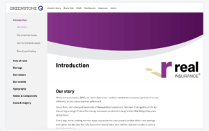
Real Insurance built their brand portal to solve a universal workplace headache: wasting time hunting for the right files to keep on message. Their clean, intuitive system puts every approved asset logos, campaign materials, even brand guidelines—just a few clicks away, eliminating the version confusion that used to plague teams. The portal works like a well-organized digital filing cabinet, with clear labels and smart search that lets employees help themselves instead of interrupting designers. Early users in marketing and digital teams report significant time savings during busy campaigns, now finding materials in minutes rather than hours—all while knowing they’re using compliant, up-to-date assets. Built-in license tracking and approval workflows provide added assurance, particularly when sharing externally. Though still in pilot phase, the portal has already eliminated the “which version is current?” frustration while establishing itself as the single source of truth for maintaining Real Insurance’s trusted brand identity across all communications. Users appreciate how the system feels instantly familiar yet perfectly tailored to insurance needs, combining the ease of consumer tools with the rigor their regulated industry requires.
Best Brand Portal Design and Execution
Construction
McNab Group Brand Bank
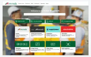
McNab’s Brand Bank portal transcends traditional asset management by becoming the connective tissue for Australia’s leading construction group – transforming chaos into cohesion across their portfolio of sub-brands. Where half a terabyte of projects once languished in labyrinthine folders, the portal now delivers military-grade organization with a builder’s practicality, embodying their “We make it easy” promise through intuitive workflows. The design mirrors McNab’s operational precision with clean, modern interfaces that prioritize high-value assets like project photography and staff headshots, while accommodating nuanced brand architectures for subsidiaries brands.
Game-changing integrations like the Adobe Creative Cloud Connector have revolutionized workflows – turning hours of file hunting into drag-and-drop efficiency. Beyond marketing teams, the portal’s facial recognition tech and SSO accessibility are bridging gaps between divisions, with measurable results: tender preparations now take minutes instead of hours, and partners report flawless artwork handovers. As McNab scales, this living system grows with them – already reducing IT tickets by 30% while maintaining ironclad version control across 45,000+ assets. More than a digital library, it’s the bedrock of McNab’s next chapter – where brand consistency and operational agility build upward together.
Best Brand Portal Design and Execution
Retail
The Good Feet Store
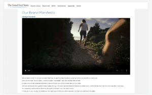
More than an asset library, The Good Feet Store’s portal is a living embodiment of the brand – a digital space where franchisees don’t just access materials but experience the brand’s commitment to support and alignment. Designed as an extension of the “Always Forward” ethos, the portal’s intuitive structure and therapeutic aesthetic (clean layouts, calming colors) mirror the physical relief the products provide, turning compliance into brand immersion. Functionally, it empowers franchisees of all skill levels with centralized logos, color systems, and campaign kits paired with clear guidelines that educate while enforcing consistency. This strategic fusion of form and purpose transforms rigid governance into shared purpose: maintaining 30 years of brand trust while eliminating operational friction. By making every interaction (whether it’s navigating typography rules or downloading assets) feel authentically “Good Feet,” the portal doesn’t distribute brand elements; it reinforces why they matter.
Best Rebrand or Brand Update
Healthcare and Pharma
Medical Informatics Corp
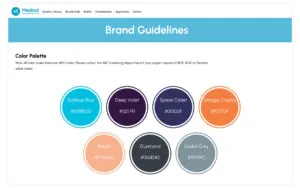
Medial Informatics Corps’ new brand portal solves two big problems at once: it keeps their marketing materials organized while making sure everything meets strict healthcare rules. For a team that works with FDA-approved software, having the right documents is critical – and thanks to the online brand portal – anyone in the company can quickly find the latest approved versions without raising a ticket with the marketing team.
The portal makes files easy to find with clear metadata (tags) showing which files are up-to-date and compliant. No more guessing if you’re using the right logo or outdated brochure. Employees love being able to help themselves, and leaders rest easy knowing every shared document follows regulations automatically. Everyone gets what they need quickly while staying safely within guidelines. For a healthcare company where rules change often, that peace of mind is priceless.